

Relogeo is a relocation discovery experience designed to help people get digitally acquainted with places they’re considering moving to—before committing.
Built to reduce uncertainty and regret, it supports clearer, more confident decision-making early in the
relocation process.
-
UX/UI Designer/Researcher
-
18 months
-
Web
-
Figma
Lyssna -
The Problem
Relocation isn’t a casual decision. It affects nearly every part of daily life—finances, health, relationships, and routines—in ways that are difficult to fully understand ahead of time.
For many people—especially later in life—the dominant emotion isn’t excitement. It’s anxiety about making the wrong choice and fear of the unknown. When limited time and financial constraints make it difficult to truly get acquainted with a place before moving, expectations are often shaped by assumptions rather than lived experience, increasing the risk that reality won’t match what people imagined.

Meet Bob & Sue
Derived from research, composite personas Bob and Sue represent people navigating early-stage relocation, particularly later in life. They’re motivated by affordability and quality of life, but often feel overwhelmed by the volume of information required to make a confident decision. More than anything, they want clarity they can trust before making a major life change.

What makes this difficult:
Limited time and financial flexibility to spend extended time “testing out” a location
Too much information that’s often scattered, conflicting, surface-level, or skewed
Expectations shaped by assumptions rather than lived experience
Bob & Sue’s Reality
Bob & Sue are trying to:
Understand whether a place will realistically fit their lifestyle and budget
Feel confident in a decision without being able to spend extended time there
Compare locations without relying on fragmented, biased, or idealized sources
The Core Problem
People relocating—especially later in life—often have to make decisions without truly understanding what day-to-day life in a place will be like.
When time and financial constraints limit their ability to get acquainted with a location, expectations are shaped by assumptions rather than lived experience. This gap between expectation and reality creates anxiety, erodes confidence, and increases the risk of regret after the move.
Design Goal
Help people feel more confident before committing to a relocation decision
Reduce uncertainty by setting clearer expectations around cost of living, lifestyle, and day-to-day realities
Support informed decision-making for users who don’t have the time or financial flexibility to explore locations in person

What I Needed to Learn
Before designing a solution, I needed to understand:
How people feel during the early stages of relocation and where uncertainty shows up the most
What factors influence whether a place feels like a good fit - beyond surface-level impressions
How people currently research prospective locations and where that process breaks down
What information helps users feel confident vs. overwhelmed
Research Approach
To define the problem and audience, I conducted:
Qualitative interviews
with people to understand emotional, financial, and logistical challenges
-
5 individuals
-
1 in-person, 4 remote
-
Individuals with long-distance relocation experience (chosen due to higher complexity and stress compared to local moves)
Secondary research
to contextualize relocation stress, affordability concerns, and decision-making behaviors
Competitive analysis
to evaluate existing relocation tools, identify gaps, and uncover missed opportunities

Key Research Insights
Research revealed two consistent challenges:

Limited time and finances made
extended visits unrealistic,
increasing uncertainty and decision risk

Gaps in understanding led to
misaligned expectations,
often resulting in regret and
unexpected costs after moving
While information was widely available, participants still struggled to understand what day-to-day life in a place would actually feel like.
From Insights to Design Direction
These insights shaped the design focus:
Help people understand what living in a place actually feels like, not just what it looks like on paper
Reduce reliance on idealized or secondhand representations of locations
Support informed decisions without requiring extended visits or relocation trials
The goal wasn’t to give users more information—it was to help them feel acquainted enough to commit with confidence.

The Solution
Relogeo was designed to reduce the uncertainty people face when relocating without truly knowing a place. Rather than relying on idealized or fragmented information, it helps users get digitally acquainted with locations so they can make more confident, informed decisions before committing.
What Relogeo Helps Users Do
At a high level, Relogeo helps users do three core things:
Get acquainted with a place before committing to a move, rather than relying on surface-level impressions
Understand how locations align with lifestyle and priorities, including cost of living and day-to-day needs
Compare places in a way that feels clear and realistic, instead of overwhelming or overly idealized
MVP Focus
For the MVP, I focused on features that helped users get digitally acquainted with a location:
Guided onboarding —
to capture user priorities, preferences, and constraints
Clear cost-of-living breakdown —
to show how a location aligns with a user’s budget
Account creation —
to support a personalized experience
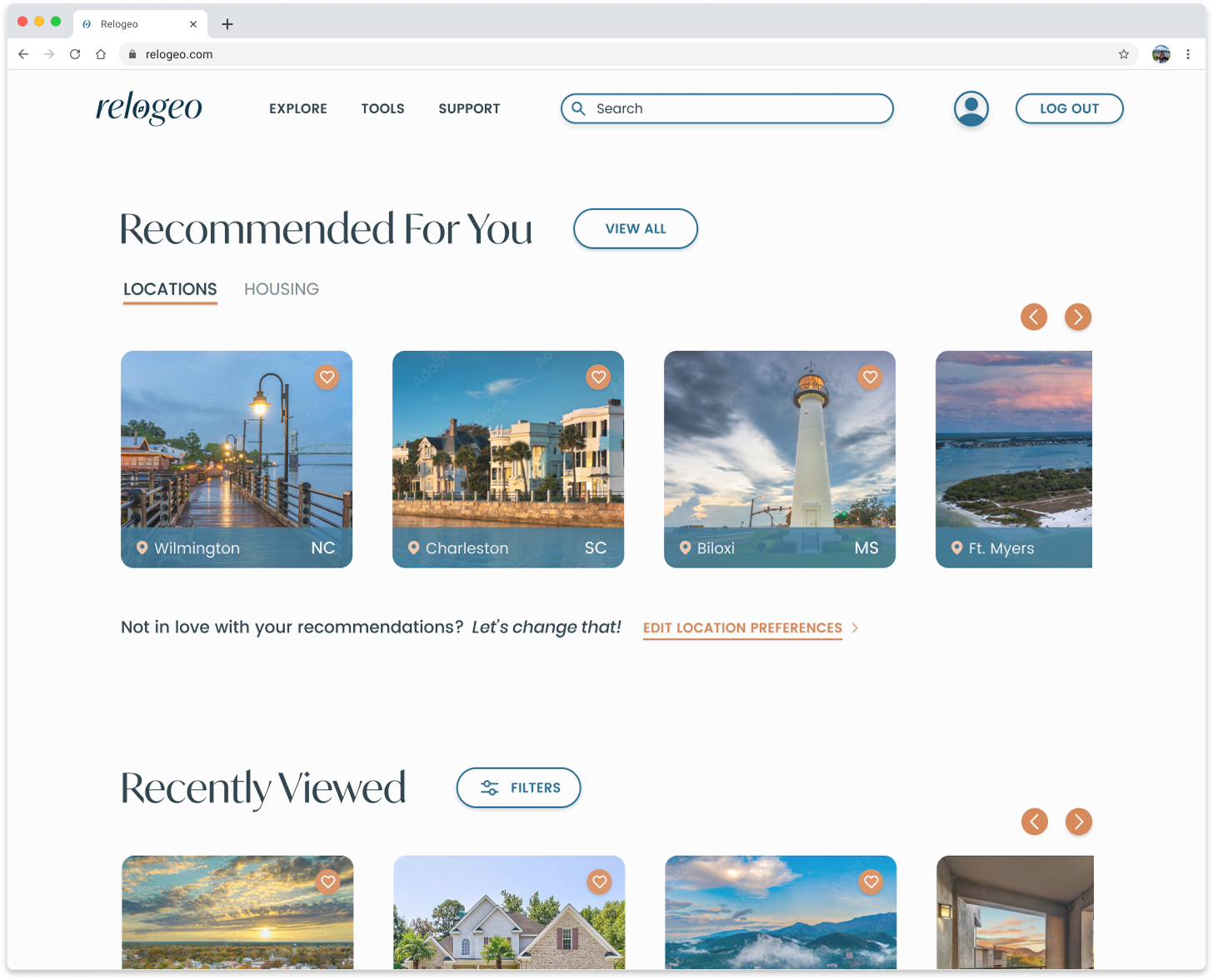
Personalized homepage —
that reflects those priorities through tailored location recommendations
Each feature was designed to work together to reduce uncertainty and help users form realistic expectations - without overwhelming them.
Design Strategy & User Flows
To keep the MVP focused, I prioritized a small set of core user flows that directly supported early decision-making and reduced uncertainty during the relocation process.
Core user flows prioritized for the MVP
Account creation & onboarding
A guided flow designed to capture user priorities, preferences, and constraints early, so recommendations feel personal rather than generic.

Search locations & view details
Allows users to explore recommended locations and understand what living there might actually be like beyond surface-level impressions.
View cost-of-living breakdown
Helps users understand how their budget aligns with a location’s expenses, reducing surprises and financial uncertainty.
These flows were intentionally scoped to support confident early-stage decisions, rather than attempting to solve the entire relocation journey at once.
Usability Testing & Validation
Validating whether core flows felt clear, navigable, and flexible enough to support confident relocation decisions
-
6 individuals
-
Moderated
2 in-person, 4 remote -
4 key task flows
-
Click-through hi-fi prototype
-
Figma
Lyssna
Google Meet
How I Tested
Once the core MVP flows were defined, I conducted usability testing to validate clarity, ease of navigation, and user confidence.
Testing focused on the most critical early-stage tasks:
Creating an account and completing onboarding
Searching for and viewing a location
Finding and viewing cost-of-living information
Revisiting and adjusting location preferences
Rather than looking for perfection, I paid close attention to where users hesitated, expressed uncertainty, or asked questions, since those moments often revealed where the design needed more clarity.

What Testing Revealed
Testing largely validated the core experience — participants found the product intuitive and easy to navigate.
Where issues appeared, they weren’t about the concept itself, but about clarity:
Inactive elements caused confusion and misclicks
Limited feedback after actions left users unsure if tasks were complete
Editing location preferences felt unclear within test context
Cost-of-living information felt disconnected from the broader location context
These moments directly informed what I chose to prioritize next.
Key clarity issues identified directly informed priority UI refinements.
Testing confirmed the overall direction while revealing specific opportunities to improve clarity and confidence throughout the experience.
Iteration & Priority Revisions
Narrowing scope to address clarity gaps and unblock core user flows
How I approached revisions
After usability testing, revisions focused only on issues that directly impacted core user flows.
Priority decisions were based on:
Clear breakdowns in the current experience
Missing functionality required to complete key tasks
Changes realistically addressable within scope and time constraints
Rather than iterating on everything that surfaced during testing, I intentionally narrowed scope.
Lower-impact ideas and edge cases were deprioritized so effort could be focused on changes that would meaningfully improve the user experience.
Revisions implemented
Onboarding: supporting different budgeting needs
During usability testing, one participant pointed out that while budgeting was part of onboarding, they were never asked how much they were actually willing to spend.
That moment revealed an important gap: even when a system can estimate a budget, that number may not reflect a user’s real constraints or comfort level. It also highlighted that some users may arrive with a specific number in mind before ever engaging with the product.
Revisions to onboarding were made to account for both scenarios:
Users who want help understanding or estimating their budget
Users who already know what they’re willing to spend
To support this, the onboarding flow was updated to include:
“Willing to spend” input allowing users to set clear affordability boundaries
Fully built-out expense tab addressing a critical gap for users relying on budget calculation
In addition to improving clarity during onboarding, capturing “willing to spend” also creates flexibility for future iterations to support different types of relocating users with varying levels of financial certainty.
Refining location preference categories
During testing, some preference categories in onboarding felt ambiguous due to overlapping definitions.
Revisions focused on:
Clarifying category labels
Reducing overlap between similar preferences
Minimizing confusion and friction during selection
Editing location preferences: clearer system feedback
During usability testing, users were often unsure whether their preference changes had actually been saved.
Rather than redesigning the entire edit preferences experience, I focused on that specific point of uncertainty.
Saving changes previously returned users to recommendations with no clear feedback
A loader and confirmation state was added to indicate the system was updating results
Before
After

This helped communicate that the system was working and that changes were successfully applied — improving confidence without adding complexity.
Cost of living in context
Testing revealed that cost-of-living information felt disconnected when separated from location details.
Because affordability is a core relocation factor, isolating it unintentionally suggested it was secondary rather than central.
Integrating cost-of-living data directly into the location details experience
Building supporting navigation so cost data could be explored alongside lifestyle and environmental factors
This better reflected how people actually evaluate relocation decisions in practice and clarified Relogeo’s value proposition — helping users make informed, realistic decisions rather than browsing locations in isolation.
Before
Before
After
After
Before
This helped users more confidently express what mattered to them without second-guessing their inputs.
After
After
Revisions focused on:
After
Designing for Clarity, Accessibility, & Trust
Visual design decisions were a direct extension of the research, personas, and wireframe structure — not a separate or purely aesthetic phase.
Visual design decisions were guided by the same research and persona insights that shaped the product itself.
Because Bob and Sue can feel overwhelmed by dense or visually complex interfaces, the visual system prioritized clarity, contrast, and readability over decoration. Color, typography, iconography, and layout were all chosen to feel calm, approachable, and easy to understand, especially for users navigating a high-stress decision like relocation.
Wireframes played a critical role in grounding these decisions. They defined layout, spacing, and hierarchy early, ensuring the interface remained clean and usable before visual styling was applied. This prevented the UI from becoming visually driven for its own sake and helped maintain focus on what mattered most to users.
From a business and technical standpoint, components were designed to be reusable and scalable, allowing the system to grow over time without increasing complexity or cognitive load.
From wireframes to UI decisions
Early calculator concept
Wireframes defined hierarchy and spacing before visual styling was applied — and revealed when ideas weren’t working structurally.
In some cases, wireframes also served as early evidence that a concept wasn’t working as intended.
An initial idea for cost-of-living was to create a standalone calculator that pulled budget and location data from onboarding. However, when translating that idea into wireframes, it became clear that the concept didn’t hold up structurally. The screen struggled to accommodate the breadth of cost-of-living data users needed while still supporting thoughtful, realistic decision-making.
Rather than forcing the concept forward, the wireframes helped clarify that cost-of-living needed to live in context — alongside lifestyle and location details — which directly informed later design decisions.
Cost of living evolution
What I Learned
Reflecting on the process revealed lessons that continue to shape how I approach UX design.
Strong ideas aren’t enough — knowing when to explore and when to commit matters just as much.
Early in the process, I explored multiple solution directions, including a buddy-mentor model and a simplified AI assistant. While some ideas felt promising at first, working through low-fidelity storyboards revealed limitations around flexibility, feasibility, and user comfort with technology. Those explorations helped narrow direction before investing too deeply.Research and structure need to lead visual design — even when it feels uncomfortable at first.
Coming from a visual design background, my instinct is often to start with visuals. This project reinforced how valuable it is to let research, personas, and wireframes define the path first. By the time visual design decisions were made, the foundation was already in place — resulting in a more confident, consistent, and user-aligned interface.Prioritization is a core design skill, not a compromise.
Time and scope constraints forced intentional decisions about what truly impacted the user experience. Rather than designing for every possible scenario, I focused on changes that meaningfully reduced uncertainty and supported confident early-stage decisions.Usability testing is as much about what not to build as what to refine.
Testing didn’t just validate what worked — it clarified which ideas weren’t worth pursuing. That clarity saved time, reduced complexity, and helped align the product more closely with real user needs.
AI assistant storyboard
Buddy-mentor match storyboard
Future Opportunities
Some features were intentionally identified early but deferred from the MVP to protect focus.
The MVP centered on helping users get meaningfully acquainted with a place and evaluate whether it realistically fits their lives. Once that foundation is validated, several opportunities naturally extend the experience:

Save and favorite locations
To support users comparing options over time without restarting their research.Community and social features
To help users establish connection after relocating — a need that surfaced consistently during research.Support for job-based relocations
For users who already know where they’re moving but still need help getting oriented.AI-assisted insights (longer-term)
To help users interpret tradeoffs or surface patterns — once trust, clarity, and data transparency are firmly established.
These ideas were not overlooked — they were intentionally deferred to ensure the MVP delivered meaningful value without unnecessary complexity.
Closing Thoughts
Relogeo started with a simple but meaningful problem: people often commit to relocation decisions without truly knowing what life in a place will be like.
Through research, testing, and focused iteration, this project explored how a digital experience could help users feel more acquainted with prospective locations, make more informed decisions, and reduce the stress that often comes with moving.
More than anything, this case study reflects how I approach UX — grounding decisions in real user needs, prioritizing clarity over complexity, and making intentional tradeoffs to deliver meaningful value.