A mobile-first responsive website for a local food truck, designed to help customers quickly access the menu, current schedule, reviews, and other essential business information.
-
Responsive Web Design
-
UX/UI Designer/Researcher
-
Four weeks
-
Mobile (Primary)
Desktop (Secondary)
-
Competitive Analysis
User Persona
Problem Statement (POV/HMW)
Feature Set
Sitemap
Responsive Wireframes
Prototype
-
Figma, Google Workspace
-
Final mobile experience:
Kitchen Little responsive website
The Problem
Kitchen Little primarily relied on Facebook and word of mouth to share its rotating daily specials, schedule, location, and updates.
This raised an important question:
Could a dedicated website make essential information easier for customers to access?
Research Approach
I conducted five in-person, semi-structured user interviews alongside a competitive analysis of four existing food truck websites to understand:
Why users visit food truck websites
What information they expect to find
How that information should be prioritized
During the interviews, participants evaluated the four websites using the following scenario:
“Imagine that you’re hearing about a new food truck that’s coming to your area for the first time. Before deciding whether to visit, what are some of the first things you’d want to know?”
This provided insight into:
participants' decision-making process
how effectively existing websites supported the information users prioritized

Key Research Insights
100% of participants

Wanted easy access to the menu

Wanted prices displayed with menu items

Disliked complicated navigation
80% of participants

Valued reviews before trying a new food truck

Commented on food photography
Key Takeaway
Users wanted the information needed to decide whether to visit—and they wanted to find it without having to hunt for it.
Meet Sarah
“If I'm hungry, I don't want to hunt for the menu—
I just want to know what you have.”
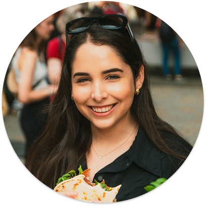
Based on my research, I created Sarah, a persona representing customers deciding whether a new food truck is worth visiting.
Key Insight
Sarah needs the information that influences her decision presented clearly and prominently so she can quickly determine whether a food truck is worth visiting.
Defining the Design Direction
Using the research findings, I developed a Point of View statement and How Might We question to define the design direction.
HMW Question
How might we help people quickly access the information they need to determine whether a food truck is worth trying?
POV Statement
I'd like to explore ways to help people evaluating unfamiliar food trucks access the information they need before deciding to visit because they rely on multiple sources of information to determine whether a food truck is worth trying
Prioritizing Features
Based on research findings, I prioritized features that surfaced the information participants consistently identified as most important when deciding whether to visit a food truck.
The resulting MVP prioritized features that help customers quickly evaluate whether Kitchen Little was worth visiting such as:
Daily specials with pricing
Location (with map) and hours
Food and truck photography
Customer reviews
Supporting features were also included to build trust, provide additional context, and support customers who wanted to learn more before deciding whether to visit. These features included:
About page
Full menu
Contact information
Together, these features balanced users' immediate decision-making needs with the additional context needed to build confidence in trying a new food truck.
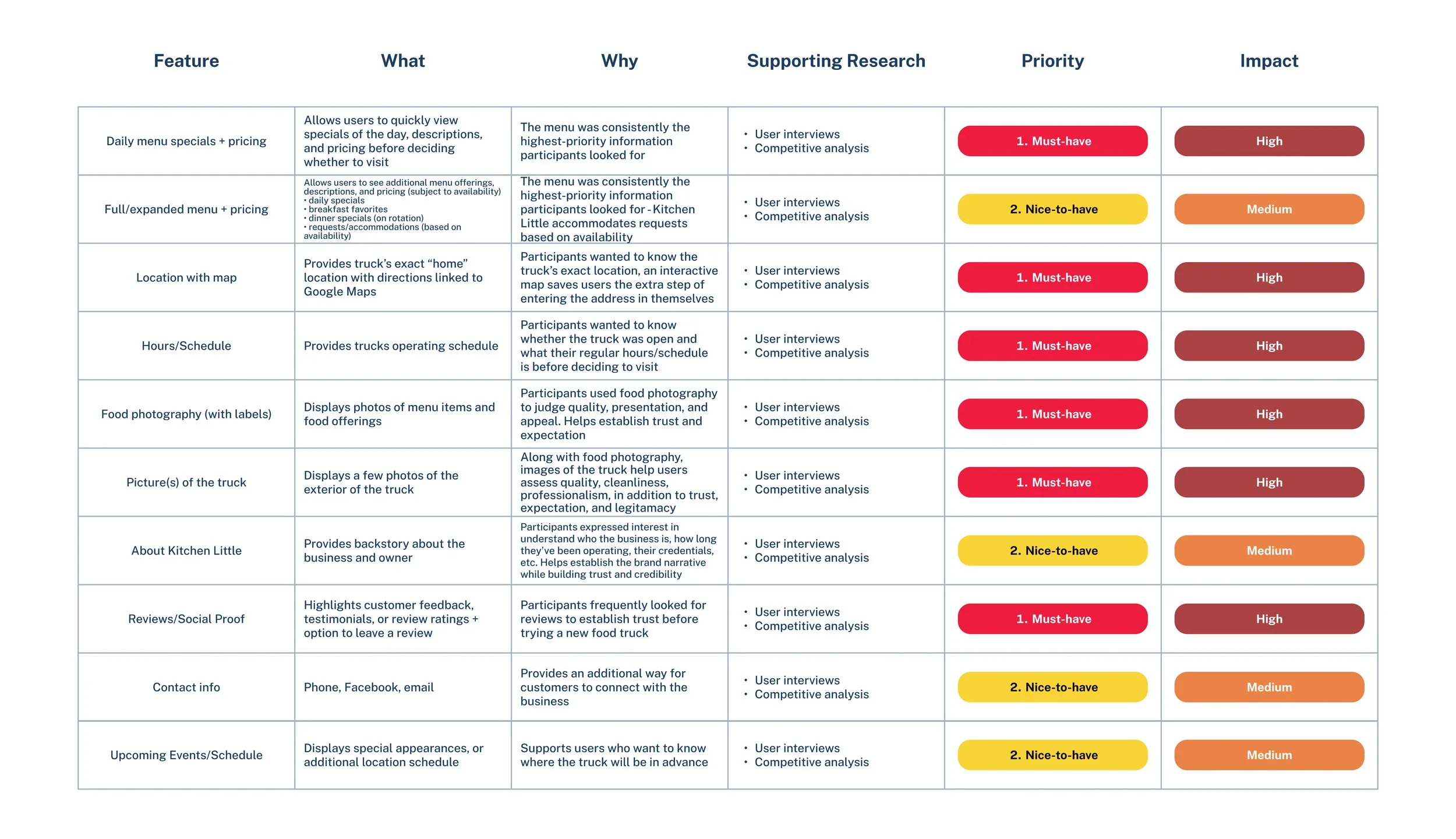
Feature prioritization:
Identifying the core content and functionality to include in the Kitchen Little website
Structuring the Experience
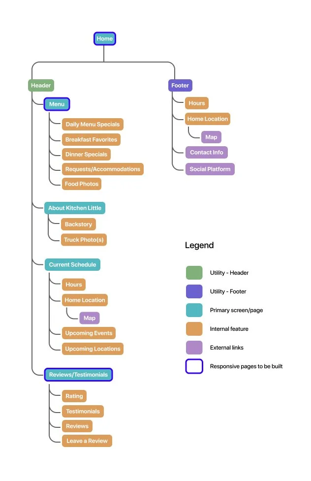
With the core features defined, I created a sitemap to organize the website's content and establish a clear information hierarchy around the information users prioritized most.
Sitemap:
Organizing Kitchen Little's core content and navigation structure
Designing the Experience
With the site structure established, I translated the sitemap into low-fidelity responsive wireframes, prioritizing the mobile experience as the primary screen because customers were most likely to access the website while deciding whether to visit the food truck. I then adapted the experience for desktop as a secondary device.
The wireframes went through three rounds of iteration, incorporating mentor feedback to refine the organization, navigation, and content hierarchy before moving into high fidelity.
Primary mobile screens:
Low-fidelity wireframes featuring the Home, Menu, and About Kitchen Little screens
Secondary desktop screens:
Responsive low-fidelity wireframes featuring the Home and Menu screens
Menu:
Initial menu organization with key information and menu selection
Homepage:
Initial content hierarchy prioritizing menu access and daily specials
About:
Initial content structure using progressive disclosure to organize business information
High-Fidelity Design
Initial Solution
Guided by user research, the high-fidelity designs were developed around four core design priorities:
Prioritize essential information
Surface the menu, schedule, location, and reviews to support quick decision-making
Build trust
Introduce Kitchen Little through food and truck photography, customer reviews, and story
Mobile homepage:
Prioritizes today’s specials and essential visit information
Mobile menu and menu detail:
Organizes menu categories, specials, and pricing for quick decision-making
Desktop homepage:
Responsive layout maintaining quick access to essential information
Mobile reviews:
Showcases customer reviews and trust signals
Reduce unnecessary searching
Organize content with a clear information hierarchy and intuitive navigation
Design for easy maintenance
Keep content simple to update for a single owner managing rotating daily specials
Desktop menu:
Responsive layout preserving menu organization and content hierarchy
Mobile about:
Introduces the business story to build familiarity and trust
Responsive Desktop Layouts
The mobile-first design was adapted for desktop while maintaining the same information hierarchy and core functionality.
Usability Testing
To evaluate the effectiveness of the high-fidelity designs, I conducted five moderated usability tests using an interactive Figma prototype.
Participants completed four core experiences focused on finding key information customers would need before deciding whether to visit Kitchen Little.
-
Five individuals
-
Moderated usability testing with think-aloud protocol
-
4 in-person sessions, 1 remote session
-
Participants completed four core experiences:
Explore Kitchen Little from the homepage
Explore the menu
Learn about Kitchen Little
Use reviews before making a decision
-
High-fidelity mobile prototype tested in Figma
View prototype
Testing Insights → Iterations
Usability testing confirmed that participants could successfully find the information needed to evaluate Kitchen Little before visiting, while revealing opportunities to improve the clarity, organization, and discoverability of key content.
Iterations focused on the areas that created the most confusion during testing:
Menu organization
Navigation
Supporting information
Reorganized Menu Architecture
Highest-priority finding
Problem
Participants understood the importance of the menu but struggled to interpret how it was organized. Many expected menu categories to follow more familiar meal groupings and had difficulty finding information quickly.
Design Changes
Separated breakfast and dinner offerings into two distinct menu tabs
Added secondary navigation links within each menu
Kept primary menu tabs fixed while scrolling through longer pages
Moved Today’s Specials into the Breakfast Menu and reorganized dinner offerings under This Week’s Specials
Removed the hero image to keep important menu content visible earlier on the page and create a clearer transition between navigation and menu content
Original menu architecture before usability-driven revisions

Updated menu architecture featuring separate meal sections and improved navigation
Improved Menu Content Hierarchy
Prioritizing critical information
Problem
Important menu information was buried beneath disclaimers, a hero image, and a download button, requiring unnecessary scrolling before users reached the content they were looking for.
Design Changes
Prioritized essential menu information at the top of the page
Kept frequently referenced notices ("Menu subject to change" and "Tax included") visible near the top
Moved dietary and food safety disclaimers to the bottom of the menu
Removed the hero image and download CTA to reduce clutter and bring menu content into view sooner
Before:
Original menu layout prioritizing disclaimers, hero imagery, and CTA before menu content
After:
Revised menu layout prioritizing essential menu information while preserving supporting details
Improved Location and Map Discoverability
Helping users find the truck
Problem
Participants did not immediately recognize how to access directions, and the location description introduced unnecessary ambiguity about where the truck was located.
Design Changes
Replaced the map styling with a recognizable Google Map interface image
Made the map and map icons interactive to better communicate that they could be tapped
Converted the street address into a direct Google Maps link for one-tap navigation
Clarified the location description to remove ambiguity and and better communicate where the truck is located
Before:
Original location section with unclear map interaction and ambiguous location description
After:
Updated location section with recognizable map interactions and direct navigation to Google Maps
Improved Navigation and Way-finding
Helping users move through the site
Problem
Participants did not recognize the logo as a path back to the homepage, making navigation less predictable.
Design Changes
Added a dedicated Home link to the main navigation
Added a Home link to the footer to provide consistent access throughout the site
Before:
Navigation relied on the Kitchen Little logo as the only path back to the homepage
After:
Dedicated Home links added to the main navigation and footer for more predictable navigation
Simplified Unnecessary Interactions
Removing friction
Problem
Several interactive elements added unnecessary complexity without helping users accomplish their goals. Participants questioned or overlooked features that provided little value for a menu that changes regularly.
Design Changes
Replaced About page accordions with static information cards to make business information immediately visible
Removed the date selector from Weekly Dinner Specials to focus on current offerings
Removed the Download Menu CTA to prioritize higher-value menu content
About content:
Static information cards make business information immediately visible
Before:
Download Menu CTA added an unnecessary interaction
Before:
Date selector allowed users to browse past dinner specials
After:
CTA removed to prioritize higher-value menu content
After:
Current dinner specials prioritized within the redesigned Dinner Menu
Additional Refinements
Beyond the five prioritized design changes, I made several smaller refinements to improve content clarity, visual consistency, and supporting business information throughout the experience.
Added payment information to the Current Schedule and transaction details to the footer
Refined typography sizes and weights to strengthen visual hierarchy
Established consistent color roles across primary, secondary, and interactive text
Updated content across the Home, Menu, and About pages to introduce weekly dinner service while maintaining breakfast as the primary focus
Added a decorative divider below the navigation to better distinguish persistent navigation from page content.
Color-corrected select menu imagery for a more polished and consistent presentation
Supporting refinements that improved clarity, consistency, and business information
Final Prototype
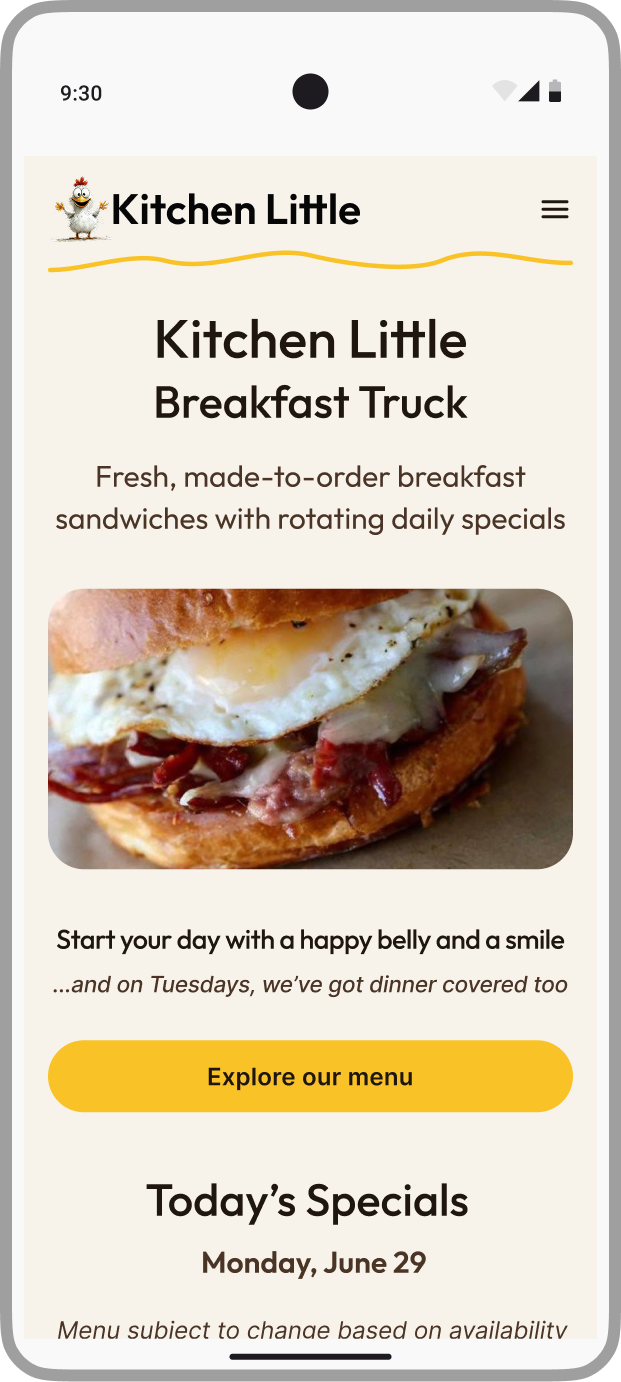
Final mobile experience:
Kitchen Little responsive website
The final prototype brings together the high-priority changes identified through usability testing and additional refinements to create a clearer, more focused experience for accessing Kitchen Little’s menu, current schedule, location, reviews, business information, and story.
Explore the final interactive prototype below


Future Testing & Opportunities
While the final iterations addressed the issues identified during usability testing, additional testing would be needed to evaluate the revised experience and determine whether further refinements are necessary.
Future testing could focus on:
Reorganized menu architecture
Evaluating whether the revised architecture makes breakfast and dinner offerings easier to understand and navigate
Navigation and location cues
Assessing whether the revised cues improve way-finding and access to directions
Menu disclaimers
Testing the placement and visibility of disclaimers to determine whether they remain accessible when needed without competing with higher-priority menu content

Reflection
This project reinforced how much a seemingly simple website depends on thoughtful prioritization and organization to create an effective experience.
Prioritize what matters most
Focusing on essential information—and removing interactions that didn't provide meaningful value—helped create a more focused experience
Let research guide the structure
Research and usability testing demonstrated how content hierarchy, information architecture, and navigation directly influence users' ability to find what they need
Design within real-world constraints
Designing for a small, owner-operated business required balancing customer needs with the practical realities of maintaining the experience