
A responsive mobile app concept designed to help pet owners manage fragmented medical records across multiple veterinary providers.
Inspired by my experience as both a former veterinary professional and pet owner, the platform supports continuity of care by centralizing records and simplifying record sharing.
-
Nine weeks
-
UX/UI Designer/Researcher
-
Responsive iOS mobile app
-
Figma, Google Workspace
-
The Problem
As both a former veterinary professional and a pet owner, I've experienced firsthand how difficult it can be to coordinate care across multiple providers.
Medical records often become scattered across clinics, emergency hospitals, specialists, emails, client portals, and paper records, leaving pet owners responsible for piecing everything together.
This fragmentation makes it difficult to:
Access the right information when it’s needed most
Confidently share records with a new provider
Maintain continuity of care throughout a pet’s medical journey
Research
To validate the problem space, I conducted five remote semi-structured interviews with pet owners who had experience coordinating care across multiple veterinary providers.

The research focused on understanding:
How participants currently managed their pets’ medical records
How records were accessed and shared between providers
Pain points experienced throughout continuity-of-care workflows
Opportunities to better support pet owners during these transitions
I synthesized the findings using a lean thematic approach to identify recurring patterns and inform design decisions.
Competitive Analysis
To complement the interview findings, I conducted a competitive analysis evaluating how existing platforms support pet owners managing medical records across multiple providers. Rather than comparing features alone, I assessed each platform against a realistic continuity-of-care use case involving an urgent visit, specialist referral, and follow-up care.
No platform provided a centralized cross-provider record hub
Record sharing remained largely manual and inconsistent
Pet owners were still expected to coordinate continuity of care themselves

Together, the interview findings and competitive analysis pointed to the same conclusion:
fragmented records force pet owners to coordinate continuity of care themselves.
Key Research Insights
Pet owners become
the coordinator of care
• Request records manually
• Repeat medical history
• Fill communication gaps in broken systems
Fragmented records
undermine continuity of care
• Records live in multiple places
• Visibility into records is limited
• Sharing information is inconsistent
Turning Research into Design Direction
Research findings were synthesized to form the primary persona and problem statement that guided product strategy and feature prioritization.
Primary Persona
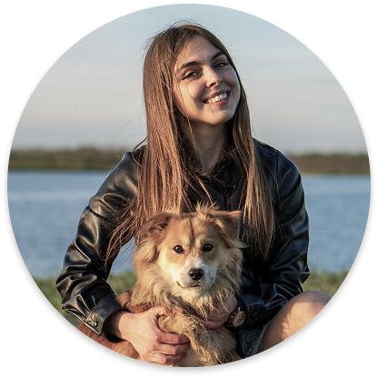
Angie represents pet owners who manage care across multiple providers and need a reliable way to organize, access, and share their pet's medical records.
“I feel like I’m the one making sure everyone has the right information…and I don’t even know if they actually do.”
Centralized Record Hub
Access records from multiple providers in one place
Design Opportunity
I’d like to explore ways to help pet owners who manage care across providers access and manage their pet’s medical history across systems because fragmented records lead to breakdowns in continuity of care.
Provider Search
& Selection
Find and select veterinary providers before sharing records

Goals:
Have all her pet’s medical records in one place
Ensure providers have the full picture before appointments
Avoid repeating information across visits
Frustrations:
Records spread out across multiple sources, making it hard to know what exists or what’s missing
Clinics don’t communicate with each other, leaving her to coordinate everything
How Might We…
How might we support continuity of care for pet owners managing care across multiple providers when medical records are fragmented across systems?
Key Product Features
Filtered Record Search
Quickly narrow records to the
most relevant visits
Selective Record Sharing
Choose exactly which parts
of a record to send
Auto-Sorted Timeline
Automatically organize records chronologically across providers
Angie


From Concept to Wireframes
Low-Fidelity Wireframes
With the flow established, I translated the experience into low-fidelity wireframes to define layout, navigation, and interaction patterns before moving into visual design.
The initial wireframes explored information hierarchy, record discovery, and the multi-step record sharing flow. Multiple rounds of refinement helped shape the experience before moving into high-fidelity design.
Low-Fidelity Wireframes:
Selected low-fidelity wireframes exploring the core record management and sharing experience.
User Flow
To ensure the experience remained focused, I mapped the end-to-end user flow around the primary task identified in the use case. Each screen was intentionally designed to support a pet owner locating relevant medical records and sharing them with a new provider before an appointment.
Use Case
The prototype was designed around a realistic continuity-of-care scenario— a pet owner needs to locate and share relevant medical records with a new specialist after an urgent veterinary visit. Rather than designing for every possible situation, I focused on a single end-to-end use case to ensure the experience remained intentional, cohesive, and aligned with the task later evaluated during usability testing.
Key Design Decisions
Homescreen → Filter records workflow
Provider search workflow
Record discovery evolution
Restructured medical alert information:
before and after
Updated bottom sheets to align with iOS Human Interface Guidelines
Tooltip
Simplified record discovery
Explored both sorting and filtering throughout design process
Ultimately refined the experience around the auto-sorted timeline and filtering
Improved information hierarchy
Reorganized medical alerts and supporting information
Refined layouts to separate navigation from critical health information
Refined system interactions
Updated bottom sheets to better align with iOS Human Interface Guidelines
Improved touch targets and interaction patterns before prototyping
Prepared for usability testing
Added contextual tooltip to support unfamiliar terminology
Added a loading state to create a more realistic prototype for testing
Primary task flow
View all medical records in one place
Filter records to find pertinent medical information
Review record details
Choose what information to share
Search for a new provider
Send selected records
Hi-Fidelity Design
The high-fidelity phase focused on translating the approved wireframes into a polished interface while refining interactions and information hierarchy. Multiple rounds of feedback helped simplify the experience and prepare the prototype for usability testing.
Send records workflow
Usability Testing
-
Five
-
Moderated usability testing
-
3 remote; 2 in-person
-
Locate and share relevant medical records with a new provider
-
To evaluate the effectiveness of the design, I conducted five moderated usability tests using an interactive Figma prototype. Three sessions were conducted remotely and two were conducted in person, with participants completing one end-to-end task focused on locating and sharing relevant medical records with a new provider while thinking aloud throughout the process.
Problem
Participants hesitated when interpreting icon-only actions
The Send Records icon was commonly mistaken for upload or download
Solution
Added text labels beneath primary actions
Replaced the Send Records icon with a clearer outbound arrow
Improved discoverability without increasing visual clutter
Simplified Record Discovery
Improve Action Discoverability
Iterations
Feedback from usability testing directly informed the final design. I prioritized changes that had the greatest impact on clarity, discoverability, and task completion, while leaving lower-priority opportunities for future exploration.
Reduce Decision Burden
Problem
Some participants questioned whether pet owners should decide which record components to share
Several preferred sending the entire record rather than
making medical decisions themselves
Solution
Changed records to display collapsed by default
Allowed users to send the full record immediately or expand it for selective sharing
Preserved flexibility while reducing unnecessary decision-making
Problem
Participants misinterpreted record status terminology
Many searched for records by visit type, not administrative status such as “new”, or “finalized”
Confusion created friction during record discovery
Solution
Replaced Status with Visit Type as the primary filter
Renamed filter categories using more familiar language
Simplified medical terminology (e.g. Radiographs → X-rays, SOAP Notes → Visit Summary) to better match users’ mental models
Strengthen Visual Hierarchy
Before (Left):
SOAP Notes • Diagnostic Images •
Medications • Discharge Instructions • Addendum
After (Right):
Visit Summary • Images • Medications • Discharge Instructions • Addendum
Before (Left):
Expanded by default
After (Right):
Collapsed by default with option to expand
Before (Left):
Status • Provider • Symptoms •
Chronic issues • Diagnostics •
Treatments • Vaccinations • Medications
After (Right):
Time Frame • Visit Type • Clinic/Provider • Health Issues • Labs/Images •
Treatments • Vaccinations • Medications
Before (Left):
Icon action ambiguity
After (Right):
• Labels added
• Replaced Send Records icon
Problem
The Snapshot section blended into surrounding content
One participant suggested it could benefit from greater
visual emphasis
Solution
Increased the prominence of the Snapshot heading
Strengthened visual hierarchy to improve scannability
and section recognition
Before (Left):
Original Snapshot title
After (Right):
Larger, more prominent Snapshot title
Final Prototype
The final prototype incorporates high-priority usability findings while maintaining focus on the core continuity-of-care workflow. The experience enables pet owners to locate relevant medical records, selectively share information, and send records to a new provider before an appointment.
Explore the interactive prototype below.

Design System
The visual language for PetConnect was guided by five core values: continuity, clarity, empowerment, trust, and compassion. These principles informed both the branding and interface design, creating an experience that feels approachable while helping pet owners confidently manage their pet’s medical history across multiple providers.

Reflection
What I learned
Users think in terms of experiences, not system
Participants naturally searched for records by visit type and reason for care rather than administrative record states, reinforcing the importance of designing around users' mental models.
Simple language can have a significant impact on usability
Replacing clinical and system-oriented terminology with familiar language reduced ambiguity and made key workflows more approachable.
Small design decisions can meaningfully improve confidence
Changes like adding action labels, refining visual hierarchy, and simplifying workflows helped reduce hesitation without increasing complexity.
Looking Ahead
Future opportunities
Manual record upload
Expanded multi pet support
User/provider communications
Case-based timeline
Missing information detection
Smart case summaries
Emergency mode
Record sticky notes
Long-term vision
Automatic provider integration
Cross-provider syncing
Universal pet identifier
Companion platform for veterinary professionals

Future testing
Future usability testing would evaluate whether the implemented iterations improve discoverability, terminology comprehension, and confidence throughout the sharing workflow.
Evaluate whether the new Visit Type filtering system improves record discovery
Assess whether collapsed records by default strike the right balance between convenience and user control
Validate that labeled actions and updated icons improve discoverability and reduce hesitation
Conclusion
As both a pet owner and former veterinary professional, this project is deeply personal to me.
I've experienced firsthand the challenges of coordinating care across multiple providers and the responsibility placed on owners to manage fragmented medical records. Designing PetConnect allowed me to combine my background in veterinary medicine with my transition into UX to explore how thoughtful digital experiences can support both pet owners and continuity of care. While this prototype represents only the beginning, it reinforced my belief that user-centered design has the power to simplify complex systems and create meaningful impact.